Google xin giới thiệu Veo 3.1 Lite, mô hình video tiết kiệm chi phí nhất…
Introducing a new look and feel for Google Calendar on the web
What’s changing
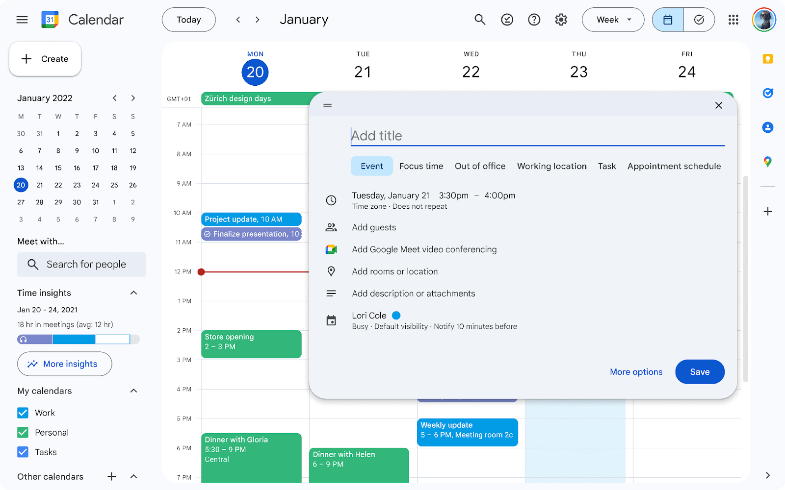
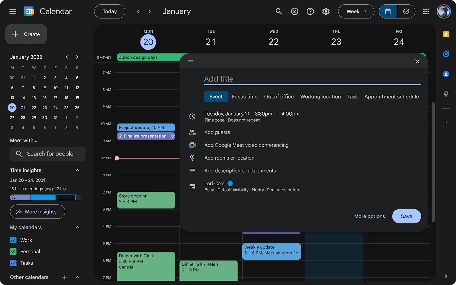
Starting today, you’ll notice a refreshed user interface in Google Calendar that is in line with Google Material Design 3 and includes:
- Controls (like buttons, dialogs, and sidebars) that are more modern and accessible
- Interface typography that uses Google’s custom-designed and highly-legible typefaces
- Iconography that is legible and crisp, with a fresh feel
We’re also introducing the ability to toggle between light mode, dark mode or device default theme options. This will provide you with a more comfortable, customizable viewing experience and can also reduce battery usage.
Additional details
These updates are applicable across the entire calendar web experience, including the task list view. When using the tasks.google.com URL, you will be redirected to the refreshed user interface and have the ability to choose between light or dark mode.
Getting started
- Admins: There is no admin control for this feature.
- End users:
- To turn on dark mode in Calendar, go to the settings icon in the top right corner > Appearance > select Light, Dark or Device default.
- Given this launch is a visual refresh to Google Calendar, it may impact the experience of installed Chrome extensions that are active when using Google Calendar. As a result, these extensions might not work as expected. We recommend contacting the developers of those extensions to report any potential issues.
Rollout pace
- Rapid Release domains: Gradual rollout (up to 15 days for feature visibility) starting on October 23, 2024
- Scheduled Release domains: Extended rollout (potentially longer than 15 days for feature visibility) starting on December 2, 2024
Availability
- Available to all Google Workspace customers, Google Workspace Individual subscribers, and users with personal Google accounts
Source: Gimasys

