Trong vài tháng qua, khi Google triển khai Gemini Enterprise trên nhiều ngành công nghiệp…
Additional tools for advanced reporting in Google Sheets
What changed?
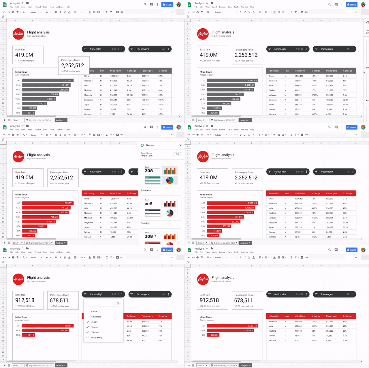
We've added three new tools to help you create more compelling reports and display data better in Google Sheets.
- Slicers
- Scorecard Charts
- Themes
Earlier this year we announced some new features for objects in Sheets. Together, these new features create a more impactful reporting experience in Sheets.

Who will be affected?
End users
Why are you using them?
You can use these tools to filter, display key data, and customize the look and feel of your spreadsheets, making it easier and faster to create attractive, informative reports
How to get started
- Admins: No action
- End users: See details below on how to use the new tools in Sheets.
Additional details
Slicers:
Slicers are a new way of filtering reports or dashboards by condition and by values. To learn more about using Slicers in Pages, check out our help center.
Scorecard charts:
Scorecard charts are a new way to call up key metrics, such as KPIs, or key metrics, in your worksheet. You have the option of showing your metrics relative to another number, for example showing a percentage increase or decrease over time. See our help center for more information on how to insert a Scorecard chart in Sheets.
Themes:
Now you can quickly change the look and feel of your entire spreadsheet – including charts, and cells – to ensure a consistent look and feel for your spreadsheets. To apply an existing theme, select Format > Theme and select an option, or to create a custom theme, select Customize at the top right.
Source: Gimasys


